Table of contents
At my current job, most of what I code has to be in vanilla JS and CSS. Outside libraries are also not always an option. So while Bootstrap and other libraries have great accordions that are accessible and responsive out the box, I had to quickly whip up my own. I hope that by sharing the code with y'all that I can help a fellow Code Newbie out there who might be in a similar position.
Accessibility
Before tackling a component like this, I always start by looking up the accessibility guidelines to guide how I structure my code. According to STVDIO, “The key to making accordions accessible is to toggle some ARIA properties and states on user click or focus events (e.g. toggle aria-hidden, aria-expanded, etc.).” In other words, when the content is visible, aria-expanded should be set to true and vice versa for when the content is not visible. Adding the ARIA property of aria-hidden=”true” is optional for accordions as long as you set the accordion body content to display: none or visibility:hidden. Screen readers will not read those elements with those properties.
STVDIO also recommends that accordions use ul and li elements to represent your accordions. However, I opted for div elements with a tablist role instead. A tablist role identifies the element that serves as the container for a set of tabs. When you use a tablist role, the accordion heading will be a tab and the accordion body will be a tabpanel. When a tab is activated it will display the tabpanel. Because an accordion is a multi-selectable, the ARIA property aria-multiselectable=”true” needs to be included on the tablist element.
In addition to the ARIA properties, the accordion also needs to be keyboard accessible. This can be done by using buttons as the accordions or setting an a element to role=”button”. In this code example, I decided to go with a elements.
I’m always trying to be better at creating accessible components, so if you noticed something that I forgot to include or could do better, let me know!
The Code
The code for the accordion ended up being simpler than I thought. I spent the bulk of the time trying to figure out how to transition smoothly when height is set to auto. Unfortunately, using CSS transitions on elements that have an auto dimension is not possible…without some hacks of course. I pursued StackOverflow and CSS-Tricks for a solution and found a couple, but ultimately went with the max-height technique, against the recommendations from CSS-Tricks. (Read the pros and cons of this technique and how it works here.) This technique best suited my use case and even though I spent too much time on it, my solution is still not perfect. But such is the joy of coding!
Anyways, back to the accordion code! Each accordion tab will consist of the following code. accordion-group is the parent element of all the tabs.
<div class="accordion-group" role="tablist" aria-multiselectable="true">
  <div class="accordion">
     <div class="accordion-heading" role="tab">
        <img src="https://i.postimg.cc/j2PR8qrb/icons8-doge-60-1.png" class="accordion-icon" />
         <h3 class="accordion-title">
            <a role="button" class="accordion-collapser" aria-expanded="false" href="#">
                Lorem ipsum dolor sit amet
            </a>
         </h3>
      </div>
  </div>
</div>
While coding this accordion, I learned about a cool CSS pseudo-class called :focus-within. This pseudo-class can be used to style the parent of an element that is currently being focused. Kind of breaks the whole “you can’t style the parent based on children with CSS ever” rule you see on StackOverflow all the time. However, this has a specific use-case and shouldn’t be abused. I used :focus-within to style the parent tab element to make the :focus more appealing and appear around more than just the accordion title.

.accordion-heading:focus-within {
  outline: 5px auto -webkit-focus-ring-color;
  outline-offset: -2px;
  outline-style: dotted;
  outline-width: 2px;
}
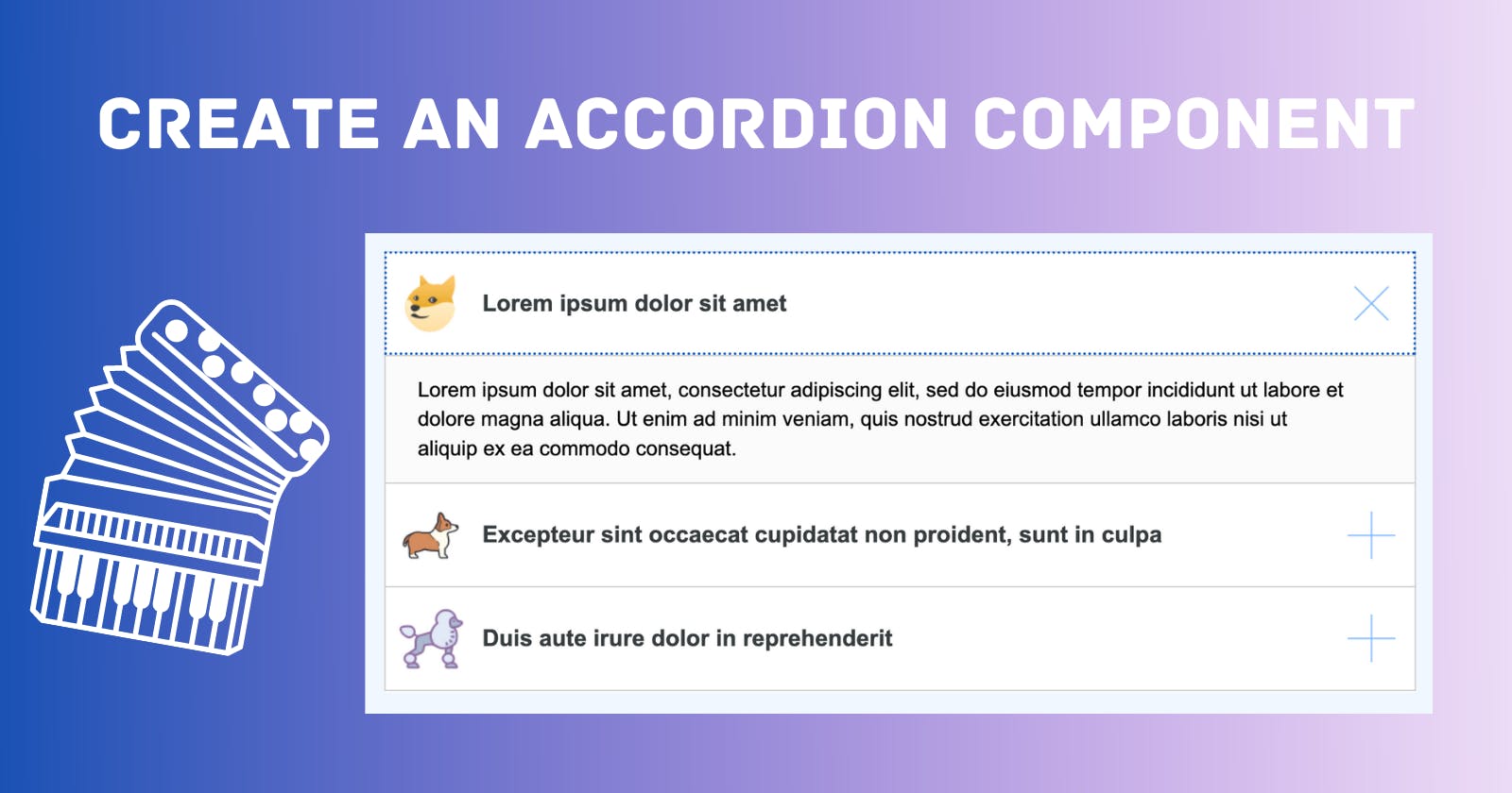
For my use case, I also needed an “animated” + and x to indicate when the tab was open and closed. I also needed an icon on the left. To achieve the + to x animation I used the following:
.accordion-heading h3:after {
  content: " ";
  background: url("https://i.postimg.cc/13fCTwcc/collapse-icon.png");
  position: absolute;
  top: 50%;
  right: 15px;
  width: 37px;
  height: 37px;
  transform: translateY(-50%) rotate(0);
  transition: transform 0.3s, -webkit-transform 0.3s;
}

.accordion-heading h3.active:after {
  transform: translateY(-50%) rotate(-45deg);
}
The active class is added whenever that tab is clicked and the icon, text, and + are all lined up thanks to my best friend flex. View the full CSS.
Not much JS was required for the accordion, just an eventListener and a helper function to swap out the ARIA properties.
document.addEventListener("DOMContentLoaded", () => {
  document.querySelectorAll(".accordion").forEach((a) => {
    a.addEventListener("click", (event) => {
      event.preventDefault();
      let collapser = a.querySelector(".accordion-collapser");
      let accordionPanel = a.querySelector(".accordion-panel");
      //  Update Aria Labels
      toggleAria("aria-expanded", collapser);
      toggleAria("aria-expanded", accordionPanel);
      //  Need to add the active class in order for the + to transition to a x
      // and for tab content to be visible
      let title = a.querySelector(".accordion-title");
      title.classList.toggle("active");
      accordionPanel.classList.toggle("active");
    });
  });

  const toggleAria = (ariaName, element) => {
    element.setAttribute(
      `${ariaName}`,
      element.getAttribute(`${ariaName}`) === "false" ? "true" : "false"
    );
  };
});
Solution
Here is the solution featuring some dog icons to make the content more fun. 🐶
I’m always open to ways to improve my code so if you noticed anything, please let me know! Drop any questions or comments down below. 🌼
